
Choosing the Perfect Color Palette for Your Projects
Are you designing a logo for a new business? Maybe you’re refreshing a room in your home. No matter what project you’re tackling, the colors you select have the power to transform the end product. Choosing the perfect color palette for your projects is so much more than picking out your favorite hues. Achieve visual harmony and conduct an efficient color selection process.
Understand the Project’s Purpose
Every design project begins with a purpose, and the color palette should align with the project’s intent. Consider the message you want to convey. Are you creating a brand that feels trustworthy and sophisticated? Are you designing a personal DIY craft that’s playful and bold? Defining the goal of your project will serve as a compass for selecting colors that resonate with the intended audience or purpose.
Use Color Theory as a Guide
Color theory is the foundation of every successful palette. By understanding primary, secondary, and tertiary colors, as well as complementary and analogous combinations, you can create balanced, visually appealing palettes.
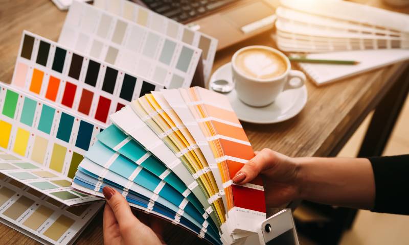
One essential aspect of this is understanding Pantone colors. It’s beneficial to learn about Pantone numbering because this skill can help you choose a consistent color palette. It provides a universal standard for color that ensures consistency across various mediums and projects.
Test and Experiment With Color Combinations
Even planned palettes look different when put into place. Before settling on your final color selections, test color combinations within your project’s context. Integrate the palette into mockups or prototypes to explore how the colors interact.
For example, a shade that seems perfect on-screen might feel overpowering in print or under different lighting conditions. Experimentation makes sure every shade looks exceptional in all mediums.
Stay Updated With Color Trends
Color trends shift, influenced by fashion, art movements, and cultural conversations. While timelessness is valuable, integrating subtle nods to contemporary trends can make your project feel relevant and fresh.
For instance, soft earth tones and nature-inspired shades are currently seeing a resurgence in popularity. Strike a balance by weaving modern influences into your work while staying true to your project’s goals.
Balance and Harmony Are Key
A perfect palette is one where no single color overpowers the others—it’s all about creating balance. Use neutral tones to soften bold colors. Consider subtle gradients to ease transitions between shades. Strive for compositions that feel polished without overwhelming the viewer’s senses.
Choosing the perfect color palette for your projects allows you to convey meaning, emotion, and identity in every detail. No matter what the project entails, an intentional color strategy is the key to success. Begin your creative process today by curating shades that speak volumes.
Would you like to receive similar articles by email?
Danuta Smoluk
Danuta Smoluk is a teacher with over three decades of experience teaching both children and adults. She specializes in teaching the Polish language to English-speakers. She has a master's degree in primary and early childhood education from WSP Słupsk (currently Pomeranian University in Słupsk) and had her degree validated by University of Toronto. Aside from education, she also has an interest in real estate and home improvement. She has planned and supervised many house renovations. She loves interior design, cooking, and gardening.


You May Also Like

How Art Museums Preserve and Protect Their Pieces

Reasons To Use a Photography Studio for Portraits